Entry tags:
(no subject)
All right, so as of now, there will be no more crossposting to LJ. One of these days, I will go through my LJ and delete all my extremely personal crap. Everything else will stay up. All my content has been imported to DW, so I'm not losing anything. I feel good about this way of handling it, so yay. Thanks to everyone who gave input!
I've been talking to![[personal profile]](https://www.dreamwidth.org/img/silk/identity/user.png) tinny about icons, and because I was stuck on my fic, and quite enjoyed the new Doctor Who episode, I made some 10x01 icons.
tinny about icons, and because I was stuck on my fic, and quite enjoyed the new Doctor Who episode, I made some 10x01 icons.
Crit, feedback, comments, all welcome!
Has anyone been watching Line of Duty? I'm mostly watching it for Paul Higgins, who played Jamie on The Thick of It. His English accent is painful. He's trying so hard, but as someone on my dash on Tumblr said, it's like watching undercover Jamie acting like he imagines Englishmen act. His character on Line of Duty is an UTTER CREEP, though, so I'm having some discomfiting dissonance with how much I love Jamie and how much I hate ... I think his name is Hilton? ACC Hilton. Blech.
Thandie Newton is playing the lead, though, and she's great. I had a huge crush on her back when she was playing Dr. Carter's girlfriend on ER. Her character on Line of Duty is a bit shady, but man, I know where my sympathies lie. Everyone else on that show is even more of a creep. Oh, gritty British crime shows.
I've been talking to
| 1 | 2 | 3 | 4 | 5 |
 |
 |
 |
 |
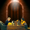 |
| 6 | 7 | 8 | 9 | 10 |
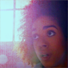 |
 |
 |
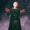 |
 |
Crit, feedback, comments, all welcome!
Has anyone been watching Line of Duty? I'm mostly watching it for Paul Higgins, who played Jamie on The Thick of It. His English accent is painful. He's trying so hard, but as someone on my dash on Tumblr said, it's like watching undercover Jamie acting like he imagines Englishmen act. His character on Line of Duty is an UTTER CREEP, though, so I'm having some discomfiting dissonance with how much I love Jamie and how much I hate ... I think his name is Hilton? ACC Hilton. Blech.
Thandie Newton is playing the lead, though, and she's great. I had a huge crush on her back when she was playing Dr. Carter's girlfriend on ER. Her character on Line of Duty is a bit shady, but man, I know where my sympathies lie. Everyone else on that show is even more of a creep. Oh, gritty British crime shows.

no subject
no subject
THAT'S where I know him from. I kept wondering! Watching British TV is always an exercise in "I know you from SOMEWHERE but am I invested enough to IMDB you ..." Though I can't say, tbh, that I remember what his role in A2A was. I did watch the show, but I barely remember the plot ... I was more a Life on Mars kinda person.
I like watching it
Oh, I love it. I enjoy British TV's tendency to be like, well EVERYONE sucks and is a terrible person, so you're just going to have to pick whom to side with based on your personal sympathies.
I'm also enjoying this season's theme of pointing out systemic misogyny, and how putting a police department in charge of investigating police corruption can't really work in the long run, because you're going to get the same systemic failures in the anti-corruption department that you also get in all other departments--except nobody's investigating them.
Though I'm not sure the show's being obvious enough about pointing that out. I got this anon on Tumblr yesterday, and it did kind of throw me. How could anyone argue she was not justified in defending herself??
Poor Gene. I still don't know whose idea it was to put him in charge of ferrying cops into the afterlife. That's such an abstract concept, and Gene and abstract concepts are just a bit antithetical.
Re icons
no subject
I think one of the main difficulty in icon making is that it's almost impossible to make a good icon without using the lasso tool (this thing) to separate your subject from the background. The only icon of the ones above that I didn't do that with is #6, and you can tell--it's not particularly well-lit, and the subject is hard to make out. For me, that icon was mostly an experiment, but I'd say it failed. ;)
The idea is to crop out your subject (usually a person, or a face; in #5 above it was Bill, Twelve, and the desk) and then either stick it onto a new background and blend the two, or to use filters like brightness, levels, curves, etc to change the lighting and colors of the subject and the background to create a good icon-look.
If I were you, I'd go and look for general GIMP tutorials on cropping with the lasso tool, on working with multiple layers, on blending modes (aka layer modes), color and lighting filters, and color and image correction tools such as levels, color balance, curves, and saturation adjustment. Sounds like a lot, but once you know your way around those tools, you should have no trouble getting into icon making--which is kind of an art of its own, because graphic design rarely requires you to work on a tiny 100x100 pixel canvas. So most fandom tutorials don't deal with graphic design basics, and more with "okay so how do I make tiny images look good?".
Good luck! If you want more info, check out the art tutorial tag on
no subject
You cannot know because a proper fannish update is still in the works :) It will be posted at the end of the month, time willing. To asnwer: it's Quentin Tarantino films, particularly the alternative histories ( Django Unchained , Inglourious Basterds ), where I have grown particularly fond of Christoph Waltz's characters *points at icon* Since I am a history geek, I'm thinking up background stories and AUs like crazy, but the fandom...is more classical celebrity fandom than transformative, so I hope to have better luck engaging here (even with people who are not fans of these canons) than over there (there's people who find my meta interesting but they never engage and I find that boring? Same with the constant repetition of picture posts of actors I like with just "They are So handsome/hot!!!". Even when I agree...it gets boring after a while?)
Sorry for the rant... I am still suffering from culture shock, I guess *wry smile*
no subject
I hear you on the lack of transformative content on other fandom platforms. It's what's driven me back to DW, too--canon can be fun, but the reason I'm in fandom is not because I love the canon content so much. Fanon > canon, always! The hot actors are all nice and well, but yeah, there are only so many pictures of Peter Capaldi making a weird face I can look at before I lose interest ...
Re: Re icons
If you want to join the iconmaker community on DW, head on over to
Almost all iconmakers are still on LJ, and almost nobody is here. We welcome everyone with open arms.
GIMP is a good choice to get into iconmaking. It's a great tool and can do everything you need to make icons.
no subject
no subject
<3 Bill and Heather, tragic space lesbians. I really want a happy ending for them!
no subject
no subject
Fun story about #7: I did not actually intend to put the XII in the background there--I just placed the texture and turned it a little, and when the icon was done, I was like OH HEY. Happy coincidence!
no subject
The lighting is excellent, and your masking is very good, too.
I especially like 1 and 8 and 9, because they have that kinda flat matte coloring that I personally love. But the less flat ones (5 and 7 especially) look great to me, too. The composition in both 5 and 10 is great.
One thing that you might want to look into is sharpening artefacts around the masked characters. It's not very pronounced in your icons, the only one I really notice it in is #3.
What I always do is smooth out the artefacts at the very end. What you do is you create a stamp copy of your layers (if you need step by step explanations, let me know), then blur that copied layer with a simple Blur filter. Set the whole mask to black. Then go over the places you think look pixelated with a small white brush. -> blur only the places where you see blocky things.
I have an action that does this, if you're interested. Do you even use Photoshop?
(Also, just because that one took me *years* to find, Photoshop has a "Refine Mask" command (CTRL-ALT-R). It works on both mask layers and active selections. But it's not that versatile outside of single selections, so ymmv.)
no subject
The lighting is excellent, and your masking is very good, too.
Thank you! I'm using the quick mask modus and my drawing tablet to mask, and it's such a luxury. I don't even remember how I used to deal with doing it on the touchpad--especially hair is so much easier when I can just literally color in the areas I want!
I'm happy to hear you like my lighting. I'm at constant war with lighting both in graphic design and drawing (and filming, back when I used to do that). You can do so many cool things with light, but it's so hard to get it right! So I'm especially pleased that you think it works here.
Is a sample copy layer like "make new from visible" in GIMP? If so, THANK YOU for telling me that exists in Photoshop (which yes, I do use PS), that's the one thing about GIMP that I really miss. I'm good on everything else; I know how to do those things--but that's really useful. I agree with your concrit about artifact blurring, but I never thought of just slapping the entire icon on as a new layer, blurring, and then masking. I always try blurring in the layers, but that gets really messy really fast.
I'll have to give that command a try! And I have to admit I don't know how to use actions in PS. Are they like macros in Office?
no subject
Man, my tablet broke years ago, and I never bothered to get a new one. But I wish I had one for hair painting. That's such a bitch with the touchpad. I mean, touchpad is better than mouse - I love using the touchpad - but pressure sensitivity is just sorely missed when trying to paint hair. *sigh*
Is a sample copy layer like "make new from visible" in GIMP?
I don't know GIMP, but that sounds like it? In PS, it's called "Stamp Visible" (Alt-Ctrl-Shift-E). I use keyboard shortcuts for everything.
I always try blurring in the layers, but that gets really messy really fast.
I do that with the original base layer, too (copy, sharpen, then mask away the too sharp stuff), but a lot of artefacts appear around text, and those you can't fix on the text layer itself. So there is no choice but to smooth them out at the very end. I hate stamping, but it's the only thing that really works in that case, so. *shrug*
I'll have to give that command a try! And I have to admit I don't know how to use actions in PS. Are they like macros in Office?
Yes. I'll give you my action set with the Blur action in it. There are a ton of others in it that you probably won't need, but hey. :) Just don't let them confuse you.
no subject
I do, too, usually, but they're always so complicated in PS. Why four keys, Adobe? "Stamp Visible" sounds like "Make New from Visible" in Adobe speak, so that's probably it. Yay! I love that command.
I agree, though, that making a new layer and working off of that isn't always great ... what if you decide that you want to do something else, after all? Then you're stuck with the stupid stamp layer. Blergh.
The stamp tool itself I like a lot, though. I made this thing on tumblr using the stamp tool like a brush, and ... well, I guess you can kind of see it, but since it's a shoddy nineties movie poster aesthetic, it actually fits within the look. Though I always stamp on a new layer, just in case ...
I'll give you my action set with the Blur action in it.
Cool! Thank you. I'll check it out and see if I can figure out how to use PS actions ... :D